Accessibility Statement
Feature Detail
Description
The Accessibility Statement feature provides a dedicated in-app screen that documents the platform's commitment to WCAG 2.2 AA compliance, lists known accessibility limitations, and explains how users can report accessibility barriers. This is a statutory requirement under the Norwegian Forskrift om universell utforming av IKT-løsninger for digital services used by organizations receiving public funding. The statement includes contact information for accessibility feedback and links to relevant regulatory bodies.
User Flow
Analysis
An in-app accessibility statement is a legal requirement for publicly funded Norwegian organizations under the Web Accessibility Directive (transposed via Norwegian IKT-regulations), not merely a best practice. NHF, Blindeforbundet, HLF, and Barnekreftforeningen all receive public funding through Bufdir, making this a compliance prerequisite for all partner organizations. Beyond legal compliance, publishing a transparent accessibility statement demonstrates accountability to users with disabilities — a core constituency for all partner organizations — and provides a structured channel for reporting barriers, enabling continuous accessibility improvement. Absence of this statement risks regulatory findings and damages the credibility of the platform's WCAG 2.2 AA commitment.
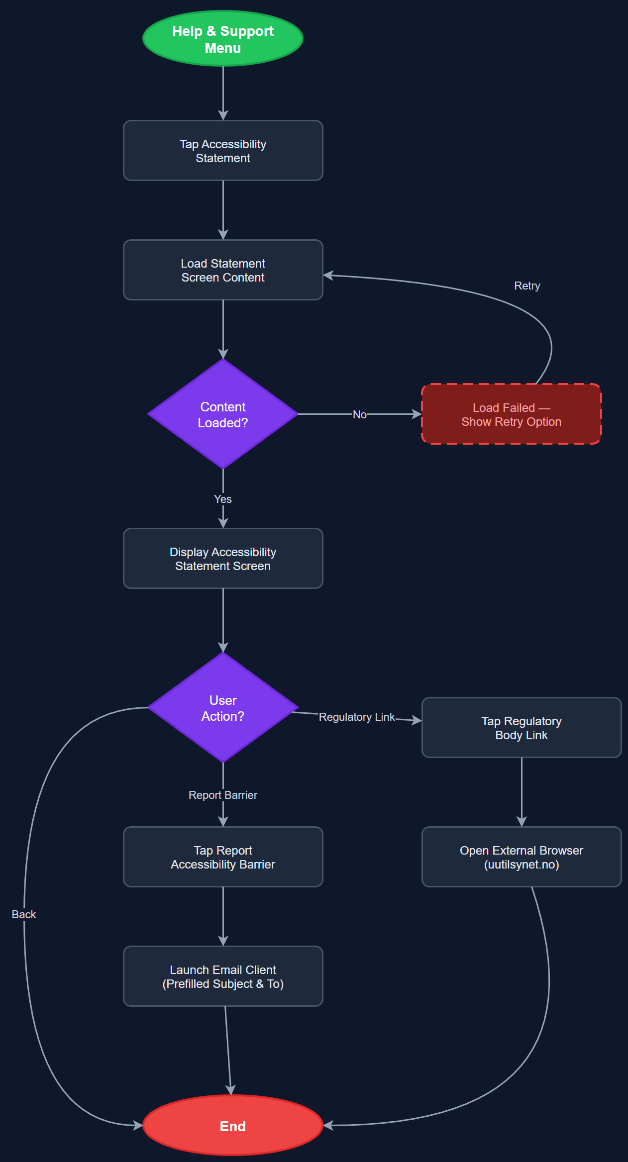
The accessibility statement is a static, read-only screen rendered in Flutter as scrollable rich text. Content follows the Norwegian Digitaliseringsdirektoratet template for accessibility statements and should be maintained as versioned static content or a CMS-backed document. The screen must itself be fully WCAG 2.2 AA compliant: semantic heading structure, sufficient contrast, scalable text, and complete screen reader compatibility. It should be reachable from the Help & Support menu without authentication. A feedback mechanism — at minimum a mailto link to a dedicated accessibility contact address — must be present. The statement must reference the current WCAG version (2.2) and conformance level (AA) and be reviewed whenever significant UI changes are shipped.
Components (108)
Shared Components
These components are reused across multiple features
User Interface (12)
Service Layer (34)
Data Layer (22)
Infrastructure (38)
User Stories
No user stories have been generated for this feature yet.