App Settings & Preferences
Feature Detail
Description
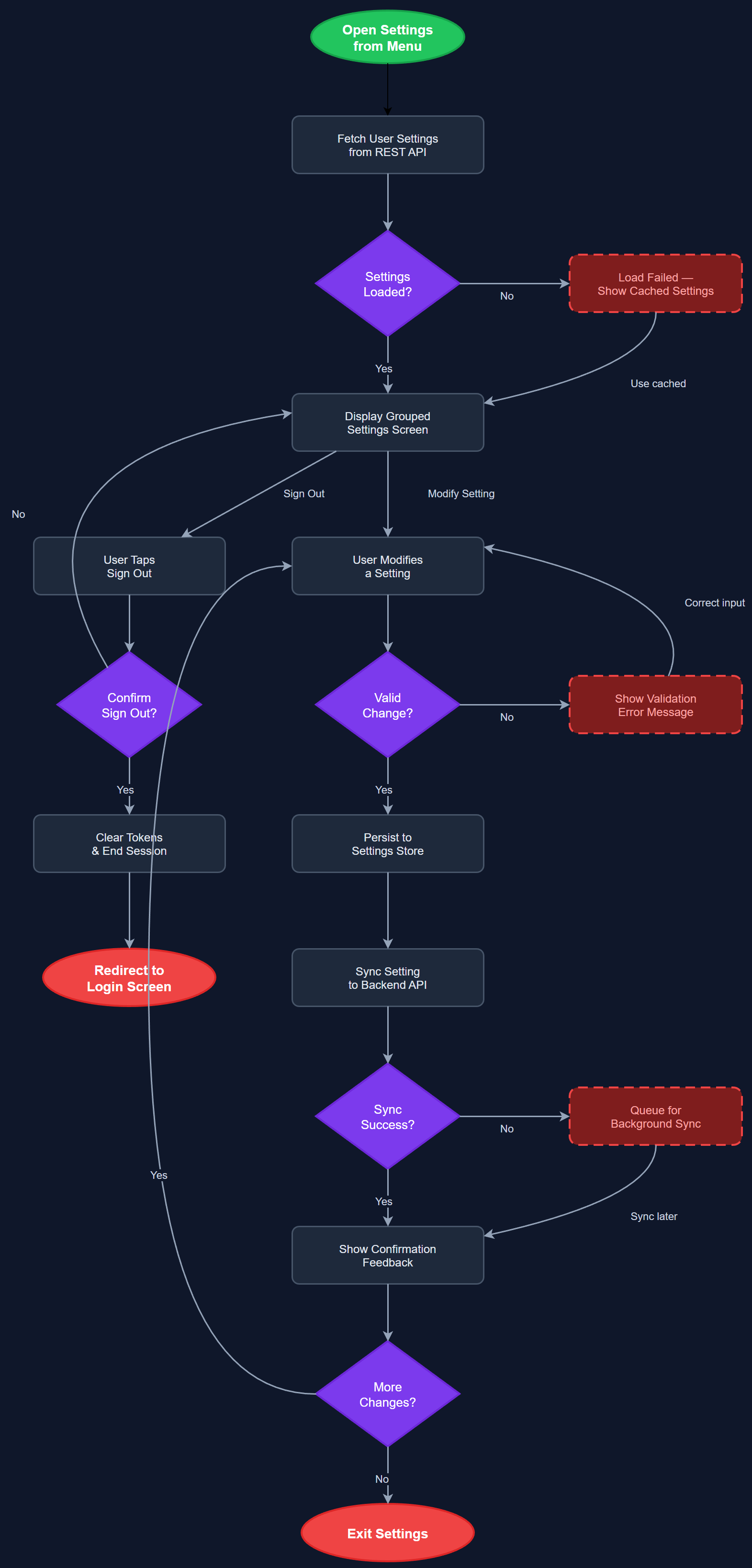
App Settings & Preferences provides a centralized screen where users can configure personal application behavior including notification preferences, language/locale selection, biometric login toggle, display settings, and account management options. The screen is accessible from the hamburger menu and follows a grouped list pattern with clearly labeled sections. Settings are persisted locally and synced to the backend where relevant (e.g., notification preferences). The screen also surfaces account-level actions such as switching profiles, signing out, and accessing privacy information.
User Flow
Analysis
A well-designed settings screen is essential for user autonomy and accessibility compliance. Users with different ability profiles — sighted, low vision, screen reader users — need the ability to configure the app to their individual needs without requiring support from their organization. Notification opt-in/opt-out is legally significant under GDPR and is required for compliant consent management. Biometric toggle gives users control over their security posture. Without a proper settings screen, support overhead increases significantly as users have no self-service mechanism for common configuration tasks. For the partner organizations serving users with varying digital literacy, a discoverable, clearly structured settings screen reduces onboarding friction and increases long-term retention.
Built as a stateless Flutter widget backed by a SettingsBloc that reads from and writes to a local Settings Store (SQLite or shared preferences). Notification preference changes are synced to the backend via the REST API asynchronously. The biometric toggle invokes the Biometric Auth Service and updates the secure token store accordingly. Language selection drives the app's localization provider (Flutter's built-in intl/l10n system), supporting Norwegian Bokmål as default with hooks for future Sami language support. The settings screen must be fully keyboard-navigable and all toggle controls must have accessible labels for screen readers. Groups are rendered as semantic sections with proper heading hierarchy. Account actions (sign out, delete account) require confirmation dialogs with clear destructive-action styling.
Components (113)
Shared Components
These components are reused across multiple features
User Interface (12)
Service Layer (34)
Data Layer (22)
Infrastructure (38)
User Stories
No user stories have been generated for this feature yet.